
User Guide
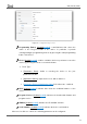
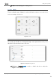
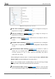
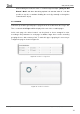
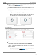
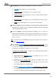
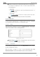
Table Of Contents
- Contents
- Document updates
- 1 Introduction
- 2 Configuration
- 2.1 General
- 2.2 Display
- 2.3 Inputs
- 2.4 Thermostat n
- ANNEX I. Video Intercom Operation
- ANNEX II. Internal Call Operation
- ANNEX III. Remote Control via IP
- ANNEX IV. Graphs
- ANNEX V. Differences with Z50 / Z100
- ANNEX VI. Communication Objects

Z50 / Z70 v2 / Z100
https://www.zennio.com Tecnical Support: https://support.zennio.com
78
Buttons Border [disabled/enabled]: sets whether the buttons will have an
outline or if only the button icon is displayed.
Touch Zone for 1-Button Controls: this parameter defines whether the touch
zone for 1-button controls is the entire box or a separated button. The behavior
in each case is:
➢ [
Box]: actions will take place by clicking anywhere in the box.
➢ [Button]: a separate button will be displayed in the upper right of the box.
The control will be only executed when the button area is clicked.
Figure 60. Touch zone in box vs in button.
2.2.2.1 CONTROL i
This screen contains the following parameters common to all type of boxes:
Figure 61. Control i
Title: text field that identifies each of the enabled controls and their
communication objects, which are designated with the prefix “[Cx][Title]”.
In addition, this field allows changing the name of the tab in ETS left menu, as
shown in the Figure 61.
➢ Use this Text in the Device [disabled/
enabled]: allows the text to be used
as the box label where this control is placed in the device.