
7.4
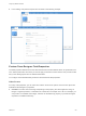
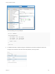
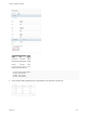
Table Of Contents
- Configuring vRealize Automation
- Contents
- Configuring vRealize Automation
- External Preparations for Blueprint Provisioning
- Preparing Your Environment for vRealize Automation Management
- Checklist for Preparing NSX Network and Security Configuration
- Checklist For Providing Third-Party IPAM Provider Support
- Checklist for Configuring Containers for vRealize Automation
- Preparing Your vCloud Director Environment for vRealize Automation
- Preparing Your vCloud Air Environment for vRealize Automation
- Preparing Your Amazon AWS Environment
- Preparing Red Hat OpenStack Network and Security Features
- Preparing Your SCVMM Environment
- Configure Network-to-Azure VPC Connectivity
- Preparing for Machine Provisioning
- Choosing a Machine Provisioning Method to Prepare
- Checklist for Running Visual Basic Scripts During Provisioning
- Using vRealize Automation Guest Agent in Provisioning
- Checklist for Preparing to Provision by Cloning
- Preparing for vCloud Air and vCloud Director Provisioning
- Preparing for Linux Kickstart Provisioning
- Preparing for SCCM Provisioning
- Preparing for WIM Provisioning
- Preparing for Virtual Machine Image Provisioning
- Preparing for Amazon Machine Image Provisioning
- Scenario: Prepare vSphere Resources for Machine Provisioning in Rainpole
- Preparing for Software Provisioning
- Preparing Your Environment for vRealize Automation Management
- Tenant and Resource Preparations for Blueprint Provisioning
- Configuring Tenant Settings
- Choosing Directories Management Configuration Options
- Directories Management Overview
- Using Directories Management to Create an Active Directory Link
- Configure an Active Directory over LDAP/IWA Link
- Configure an OpenLDAP Directory Connection
- Configure Directories Management for High Availability
- Configure a Bi Directional Trust Relationship Between vRealize Automation and Active Directory
- Configure SAML Federation Between Directories Management and SSO2
- Add Users or Groups to an Active Directory Connection
- Select Attributes to Sync with Directory
- Add Memory to Directories Management
- Create a Domain Host Lookup File to Override DNS Service Location (SRV) Lookup
- Configure Just-in-Time User Provisioning
- Managing User Attributes that Sync from Active Directory
- Managing Connectors and Connector Clusters
- Join a Connector Machine to a Domain
- About Domain Controller Selection
- Managing Access Policies
- Configuring Additional Identity Provider Connections
- Integrating Alternative User Authentication Products with Directories Management
- Configuring SecurID for Directories Management
- Configuring RADIUS for Directories Management
- Configuring a Certificate or Smart Card Adapter for Use with Directories Management
- Configuring a Third-Party Identity Provider Instance to Authenticate Users
- Managing Authentication Methods to Apply to Users
- Configuring Kerberos for Directories Management
- Upgrading External Connectors for Directories Management
- Scenario: Configure an Active Directory Link for a Highly Available vRealize Automation
- Configure External Connectors for Smart Card and Third-party Identity Provider Authentication in vRealize Automation
- Create a Multi Domain or Multi Forest Active Directory Link
- Configuring Groups and User Roles
- Create Additional Tenants
- Delete a Tenant
- Configuring Security Settings for Multi-tenancy
- Configuring Custom Branding
- Checklist for Configuring Notifications
- Configuring Global Email Servers for Notifications
- Add a Tenant-Specific Outbound Email Server
- Add a Tenant-Specific Inbound Email Server
- Override a System Default Outbound Email Server
- Override a System Default Inbound Email Server
- Revert to System Default Email Servers
- Configure Notifications
- Customize the Date for Email Notification for Machine Expiration
- Configuring Templates for Automatic IaaS Emails
- Subscribe to Notifications
- Create a Custom RDP File to Support RDP Connections for Provisioned Machines
- Scenario: Add Datacenter Locations for Cross Region Deployments
- Configuring vRealize Orchestrator
- Choosing Directories Management Configuration Options
- Configuring Resources
- Checklist for Configuring IaaS Resources
- Configuring Endpoints
- Choosing an Endpoint Scenario
- Endpoint Settings Reference
- Create a vSphere Endpoint
- Create an NSX Endpoint and Associate to a vSphere Endpoint
- Create a vCloud Air Endpoint
- Create a vCloud Director Endpoint
- Create an Amazon Endpoint
- Create a Proxy Endpoint and Associate to a Cloud Endpoint
- Create a Proxy Endpoint for OVF Host Web Site
- Create a vRealize Orchestrator Endpoint
- Create a vRealize Operations Manager Endpoint
- Create a Third-Party IPAM Provider Endpoint
- Create a Microsoft Azure Endpoint
- Create a Puppet Endpoint
- Create a Hyper-V (SCVMM) Endpoint
- Create an OpenStack Endpoint
- Create a Hyper-V, XenServer, or Xen Pool Endpoint
- Considerations When Using Test Connection
- Import or Export Endpoints Programmatically
- Viewing Endpoint Sources and Running Data Collection
- Considerations When Working With Upgraded or Migrated Endpoints
- Considerations When Deleting Endpoints
- Troubleshooting Attached vSphere Endpoint Cannot be Found
- Create a Fabric Group
- Configure Machine Prefixes
- Creating a Network Profile
- Using Network Profiles to Control IP Address Ranges
- Understanding CSV File Format for Importing Network Profile IP Addresses
- Creating an External Network Profile For an Existing Network
- Creating a Routed Network Profile For an On-Demand Network
- Creating a NAT Network Profile For an On-Demand Network
- Releasing IP Addresses By Destroying Provisioned Machines
- Configuring Reservations and Reservation Policies
- Reservations
- Choosing a Reservation Scenario
- Creating Cloud Category Reservations
- Creating Virtual Category Reservations
- Edit a Reservation to Assign a Network Profile
- Reservation Policies
- Storage Reservation Policies
- Reservations
- Workload Placement
- Managing Key Pairs
- Scenario: Apply a Location to a Compute Resource for Cross Region Deployments
- Provisioning a vRealize Automation Deployment Using a Third-Party IPAM Provider
- Configuring Endpoints
- Configuring XaaS Resources
- Creating and Configuring Containers
- Installing Additional Plug-Ins on the Default vRealize Orchestrator Server
- Working With Active Directory Policies
- Checklist for Configuring IaaS Resources
- User Preferences for Notifications and Delegates
- Configuring Tenant Settings
- Providing Service Blueprints to Users
- Designing Blueprints
- Building Your Design Library
- Designing Machine Blueprints
- Space-Efficient Storage for Virtual Provisioning
- Understanding and Using Blueprint Parameterization
- Configure a Machine Blueprint
- Machine Blueprint Settings
- Designing Blueprints with NSX Settings
- New Blueprint and Blueprint Properties Page Settings with NSX
- Configuring Network and Security Component Settings
- Using Network Components in the Design Canvas
- Using Load Balancer Components in the Design Canvas
- Using Security Components in the Design Canvas
- Associating Network and Security Components
- Configuring a Blueprint to Provision from an OVF
- Using Container Components in Blueprints
- Creating Microsoft Azure Blueprints and Incorporating Resource Actions
- Creating Puppet Enabled vSphere Blueprints
- Add RDP Connection Support to Your Windows Machine Blueprints
- Scenario: Add Active Directory Cleanup to Your CentOS Blueprint
- Scenario: Allow Requesters to Specify Machine Host Name
- Scenario: Enable Users to Select Datacenter Locations for Cross Region Deployments
- Designing Software Components
- Designing XaaS Blueprints and Resource Actions
- vRealize Orchestrator Integration in vRealize Automation
- List of vRealize Orchestrator Plug-Ins
- Creating XaaS Blueprints and Resource Actions
- Mapping Other Resources to Work with XaaS Resource Actions
- Designing Forms for XaaS Blueprints and Actions
- XaaS Examples and Scenarios
- Create an XaaS Blueprint and Action for Creating and Modifying a User
- Create and Publish an XaaS Action to Migrate a Virtual Machine
- Create an XaaS Action to Migrate a Virtual Machine With vMotion
- Create and Publish an XaaS Action to Take a Snapshot
- Create and Publish an XaaS Action to Start an Amazon Virtual Machine
- Troubleshooting Incorrect Accents and Special Characters in XaaS Blueprints
- Publishing a Blueprint
- Designing Machine Blueprints
- Working with Blueprints Programmatically
- Assembling Composite Blueprints
- Customizing Blueprint Request Forms
- Managing the Service Catalog
- Checklist for Configuring the Service Catalog
- Creating a Service
- Working with Catalog Items and Actions
- Creating Entitlements
- Working with Approval Policies
- Examples of Approval Policies Based on the Virtual Machine Policy Type
- Example of Actions with Approval Policies Applied in a Composite Deployment
- Example of an Approval Policy in Multiple Entitlements
- Processing Approval Policies in the Service Catalog
- Create an Approval Policy
- Modify an Approval Policy
- Deactivate an Approval Policy
- Delete an Approval Policy
- Scenario: Create and Apply CentOS with MySQL Approval Policies
- Request Machine Provisioning By Using a Parameterized Blueprint
- Scenario: Make the CentOS with MySQL Application Blueprint Available in the Service Catalog
- Managing Deployed Catalog Items
- Running Actions for Provisioned Resources
- Action Menu Commands for Provisioned Resources
- Configure a Metrics Provider
- Send Reclamation Requests
- Track Reclamation Requests
- Change the Reservation of a Managed Machine
- Create a Snapshot of Your Machine
- Connect Remotely to a Machine
- Configuring Remote Consoles for vSphere with Untrusted SSL Certificates
- Force Destroy a Deployment After a Failed Destroy Request
- Troubleshooting Missing Actions in the Resource Actions Menu
- Troubleshooting a Failed Deployment That Includes a vRealize Orchestrator Workflow
- Specify Machine Reconfiguration Settings and Considerations for Reconfiguration
- Reconfigure a Load Balancer in a Deployment
- Change NAT Rules in a Deployment
- Add or Remove Security Items in a Deployment
- Display All NAT Rules for an Existing NSX Edge
- Running Actions for Provisioned Resources

Table 3‑66. Appearance Tab Options
Option Description
Label and type Provide a label and select a display type.
The available display types depend on the field. Some fields
support multiple text types and others only support integers.
Possible values:
n
Decimal
n
Drop Down
n
Image
n
Integer
n
Multi Select
n
Password
n
Radio Group
n
Text
n
Text Area
n
Text Fields
Drop-down and data grid fields include a Placeholder setting.
The entered value appears as an internal label or instructions in
the drop-down menu, or as a general label or instructions in the
data grid.
Visibility Show or hide a field on the request form.
n
Constant. Select Yes to display the field on the form. Select
No to hide the field.
n
Conditional value. Visibility is determined by the first
expression that is true. For example, a field is visible if a
check box is selected on a form.
n
External source. Visibility is determined by the results of
the selected vRealize Orchestrator action.
Read-only Prevent users from changing the field values.
n
Constant. Select Yes to display the value but prevent
changes. Select No to allow changes.
n
Conditional value. Status is determined by the first
expression that is true. For example, a field is read-only if
the value in a storage field is greater than 2 GB.
n
External source. Status is determined by the results of the
selected vRealize Orchestrator action.
Rows per page For data grid elements only.
Enter the number of rows.
Custom help Provide information about the field to your users. This
information appears in signpost help for the field.
You can use simple text or HTML, including href links. For
example, <a
href="https://docs.vmware.com/en/vRealize-
Automation/index.html">vRealize Automation
documentation</a>.
Configuring vRealize Automation
VMware, Inc. 534