
5.7.1
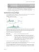
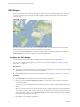
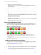
Table Of Contents
- VMware vCenter Operations Manager Getting Started Guide
- Contents
- VMware vCenter Operations Manager Getting Started Guide
- Introducing Custom User Interface Features and Concepts
- Introducing Common Tasks
- Logging In and Using vCenter Operations Manager
- Monitoring Day-to-Day Operations
- Handling Alerts
- Optimizing Your Resources
- Designing Your Workspace
- Working with Dashboards
- Create a Dashboard
- Clone a Dashboard
- Edit a Dashboard
- Delete a Dashboard
- Create a Dashboard Template
- Hide a Dashboard Tab
- Change the Order of Dashboard Tabs
- Delete a Dashboard Template
- Configure Dashboard Switching
- Share a Dashboard
- Stop Sharing a Dashboard
- Export a Dashboard
- Import a Dashboard
- vSphere Dashboards
- Working with Widgets
- Working with Dashboards
- Using and Configuring Widgets
- Edit a Widget Configuration
- Supported Widget Interactions
- Configure Widget Interactions
- Advanced Health Tree Widget
- Alerts Widget
- Application Detail Widget
- Application Overview Widget
- Configuration Overview Widget
- Custom Relationship Widget
- Data Distribution Analysis Widget
- Generic Scoreboard Widget
- GEO Widget
- Health Status Widget
- Health Tree Widget
- Health-Workload Scoreboard Widget
- Heat Map Widget
- Mashup Charts Widget
- Metric Graph Widget
- Metric Graph (Rolling View) Widget
- Metric Selector Widget
- Metric Sparklines Widget
- Metric Weather Map Widget
- Resources Widget
- Root Cause Ranking Widget
- Tag Selector Widget
- Text Widget
- Top-N Analysis Widget
- VC Relationship Widget
- VC Relationship (Planning) Widget
- Define Metric Sets for a Widget
- Index

Option Action
Orange Bound
Type the highest or lowest value that should be orange.
Red Bound
Type the highest or lowest value that should be red.
You cannot edit the color boundaries for health-related metrics, such as vCenter Operations Generated
| Self - Health Score, in the Metrics Mapping pane. The color boundaries for these metrics are
configured for you when you save the widget configuration. vCenter Operations Manager obtains color
range values for health-related metrics from global settings (select Admin > Global Settings) .
7 Click OK to save the widget configuration.
Data Distribution Analysis Widget
The Data Distribution Analysis widget shows a graph for selected metrics. For each metric, the graph shows
the data distribution of the metric, including how often it had a particular value.
Figure 4‑7. Data Distribution Widget
You can use the Data Distribution Analysis widget to compare the values of a metric over two time periods.
By default, the widget compares the last seven days to the last 30 days. The x-axis of the graph shows the
range of received values for the metric, from lowest to highest, over the selected time period. The y-axis is
the percentage of the received metrics that had that value.
The graph has a Density mode and a Distribution mode.
Density mode
Shows how often the metric had each particular value.
Distribution mode
Shows the percentage possibility that the metric was at or below the x-axis
value. The y-axis always ranges from 0 to 1. The right edge of the graph
always reaches a value of 1, which shows that all received readings were at
or below the maximum value indicated on the x-axis. At any point in the
middle of the graph, the y-axis value is the percentage of collected values
that were at or below the x-axis value, or the probability that any one
collected value was at or below that value.
To change the graph to Distribution mode, click the Change to distribution mode icon.
If you graph only one time period in either mode, the graph might include vertical lines at the 75, 90, and 95
percent levels. You can edit the widget to add or remove the percentage lines.
You can click the Date Controls icon to change either or both time periods on the graph. In the two drop-
down menus that appear, select the time periods for the graph. To show only one time period, select Not
Selected from the second drop-down menu. You can click the Date Controls icon again to hide the date.
Chapter 4 Using and Configuring Widgets
VMware, Inc. 71