
5.8.5
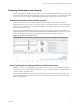
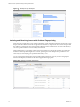

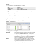
Table Of Contents
- VMware vCenter Operations Manager Getting Started Guide
- Contents
- VMware vCenter Operations Manager Getting Started Guide
- Introducing Custom User Interface Features and Concepts
- Introducing Common Tasks
- Logging In and Using vCenter Operations Manager
- Monitoring Day-to-Day Operations
- Handling Alerts
- Optimizing Your Resources
- Designing Your Workspace
- Working with Dashboards
- Create a Dashboard
- Clone a Dashboard
- Edit a Dashboard
- Delete a Dashboard
- Create a Dashboard Template
- Hide a Dashboard Tab
- Change the Order of Dashboard Tabs
- Delete a Dashboard Template
- Configure Dashboard Switching
- Share a Dashboard
- Stop Sharing a Dashboard for all Users
- Stop Sharing a Dashboard for a Group
- Export a Dashboard
- Import a Dashboard
- vSphere Dashboards
- Working with Widgets
- Working with Dashboards
- Using and Configuring Widgets
- Edit a Widget Configuration
- Supported Widget Interactions
- Configure Widget Interactions
- Advanced Health Tree Widget
- Alerts Widget
- Application Detail Widget
- Application Overview Widget
- Configuration Overview Widget
- Custom Relationship Widget
- Data Collection Results Widget
- Data Distribution Analysis Widget
- Generic Scoreboard Widget
- GEO Widget
- Health Status Widget
- Health Tree Widget
- Health-Workload Scoreboard Widget
- Heat Map Widget
- Mashup Charts Widget
- Metric Graph Widget
- Metric Graph (Rolling View) Widget
- Metric Selector Widget
- Metric Sparklines Widget
- Metric Weather Map Widget
- Resources Widget
- Root Cause Ranking Widget
- Tag Selector Widget
- Text Widget
- Top-N Analysis Widget
- VC Relationship Widget
- VC Relationship (Planning) Widget
- Define Metric Sets for a Widget
- Index

Performing Capacity Analysis
Some metrics, such as disk space use or network traffic measurements, frequently show long-term trends.
Short-term fluctuations can hide this data or make it difficult to calculate.
The capacity analysis feature looks at the overall value trend for a selected metric, tells you when a metric is
likely to reach a threshold, and indicates how confident vCenter Operations Manager is of the prediction.
This information can help you plan for infrastructure upgrades, such as adding additional storage and
network routers.
Capacity analysis information appears on the Capacity Analysis page.
Figure 1‑11. Example of Capacity Analysis Information
Analyzing and Balancing Virtual Resources
With the VC analysis feature, you can compare the metric values of different objects in your virtual
environment by using predefined heat maps or by creating your own custom heat maps.
A heat map contains rectangles of different colors and sizes, and each rectangle represents an object in your
virtual environment. The color of a rectangle represents the value of one metric, and the size of a rectangle
represents the value of another metric. For example, one of the predefined heat maps shows the total
memory and percentage of memory use for each virtual machine. Larger rectangles are virtual machines
that have more total memory. Green indicates low memory use and red indicates high memory use.
vCenter Operations Manager updates heat maps in real time as its collects new values for each object and
metric. The colored bar below a heat map is the legend. The legend identifies the values that the endpoints
represent and the midpoint of the color range.
Heat map objects are grouped by parent. A heat map that shows virtual machine performance groups
virtual machines by the ESX hosts on which they run.
Chapter 1 Introducing Custom User Interface Features and Concepts
VMware, Inc. 15