
5.7
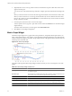
Table Of Contents
- VMware vCenter Operations Manager Getting Started Guide
- Contents
- VMware vCenter Operations Manager Getting Started Guide
- Introducing Custom User Interface Features and Concepts
- Introducing Common Tasks
- Logging In and Using vCenter Operations Manager
- Monitoring Day-to-Day Operations
- Handling Alerts
- Optimizing Your Resources
- Designing Your Workspace
- Using and Configuring Widgets
- Edit a Widget Configuration
- Supported Widget Interactions
- Configure Widget Interactions
- Advanced Health Tree Widget
- Alerts Widget
- Application Detail Widget
- Application Overview Widget
- Configuration Overview Widget
- Custom Relationship Widget
- Data Distribution Analysis Widget
- Generic Scoreboard Widget
- GEO Widget
- Health Status Widget
- Health Tree Widget
- Health-Workload Scoreboard Widget
- Heat Map Widget
- Mashup Charts Widget
- Metric Graph Widget
- Metric Graph (Rolling View) Widget
- Metric Selector Widget
- Metric Sparklines Widget
- Metric Weather Map Widget
- Resources Widget
- Root Cause Ranking Widget
- Tag Selector Widget
- Text Widget
- Top-N Analysis Widget
- VC Relationship Widget
- VC Relationship (Planning) Widget
- Define Metric Sets for a Widget
- Index

Table 4-8. Metric Graph Widget Toolbar Icons (Continued)
Icon Description
Show Entire Period Dynamic
Thresholds
Shows or hides dynamic thresholds for the entire time period of the graph.
Anomalies Shows or hides anomalies on the graph. Time periods when the metric violates a
threshold are shaded. The color indicates the criticality of the violation. You can click
the top-left corner of the shaded area to show details for an anomaly.
Show data point tips Retrieves the metric readings for the graphed data points. Click the Show Data
Values icon to show the values.
Zoom by X When you click this icon, zooming the graph affects the X axis. You can use Zoom by
X and Zoom by Y simultaneously.
Zoom by Y When you click this icon, zooming the graph affects the Y axis. You can use Zoom by
X and Zoom by Y simultaneously.
Zoom to fit Changes all graphs to show the entire time period and value range.
Zoom to Dynamic Thresholds Changes the Y axis of the graphs to match the dynamic threshold of the metric.
Compress GraphsCompress
Graphs
Shortens the Y axis of all graphs to use less vertical space.
Zoom All Graphs When you click this icon, zooming one graph changes all graphs to match.
Zoom the view Click this icon and drag to outline a part of the hierarchy. The display zooms to show
only the outlined section.
Pan When you click this icon, dragging in the graph changes the time period. It does not
zoom the graph.
Show Data Values After you click the Show data point tips icon to retrieve the data, click this icon and
point to a graphed data point to show its time and exact value. In non-split mode, you
can hover over a metric in the legend to show the full metric name, the names of the
adapter instances (if any) that provide data for the resource to which the metric
belongs, the current value, and the normal range. If the metric is currently alarming,
the text color in the legend changes to yellow or red, depending on your color scheme.
Click a metric in the legend to highlight the metric in the display. Clicking the metric
again toggles its highlighted state.
Auto Refresh Turns auto-refresh on or off.
Date Controls Select up to three time periods to show on the graph. For the first period, select a value
in the top box or select start and end times and dates. To graph multiple periods, select
the first period and select the previous periods to which to compare it. All periods
must be the same length. If you set a start date and time for the second or third period,
vCenter Operations Manager fills in the end time.
NOTE For most time periods, vCenter Operations Manager includes predicted values
for the near future. For example, if you select the last hour,
vCenter Operations Manager also shows 15 minutes into the future. If you select the
last day, vCenter Operations Manager predicts four hours into the future. Periods
longer than 30 days do not show any future time. If a user-defined time period includes
time in the future, vCenter Operations Manager shows predicted values for the
defined future period.
Generate Dashboard Creates a new dashboard that contains only the Metric Graph widget, in self-provider
mode, which shows the currently displayed metrics.
Remove All Removes all graphs.
Each graph has a toolbar at the top right. The icons on this toolbar affect only that graph.
Chapter 4 Using and Configuring Widgets
VMware, Inc. 83