
5.6
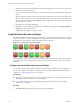
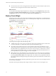
Table Of Contents
- VMware vCenter Operations Manager Getting Started Guide
- Contents
- VMware vCenter Operations Manager Getting Started Guide
- Introducing Custom User Interface Features and Concepts
- Introducing Common Tasks
- Logging In and Using vCenter Operations Manager
- Monitoring Day-to-Day Operations
- Handling Alerts
- Optimizing Your Resources
- Designing Your Workspace
- Using and Configuring Widgets
- Edit a Widget Configuration
- Supported Widget Interactions
- Configure Widget Interactions
- Advanced Health Tree Widget
- Alerts Widget
- Application Detail Widget
- Application Overview Widget
- Configuration Overview Widget
- Data Distribution Analysis Widget
- Generic Scoreboard Widget
- GEO Widget
- Health Status Widget
- Health Tree Widget
- Health-Workload Scoreboard Widget
- Heat Map Widget
- Mashup Charts Widget
- Metric Graph Widget
- Metric Graph (Rolling View) Widget
- Metric Selector Widget
- Metric Sparklines Widget
- Metric Weather Map Widget
- Resources Widget
- Root Cause Ranking Widget
- Tag Selector Widget
- Text Widget
- Top-N Analysis Widget
- VC Relationship Widget
- VC Relationship (Planning) Widget
- Define Metric Sets for a Widget
- Index

n
For each resource, the size of its rectangle is based on the number of current anomalies for that resource,
and the color of its rectangle is based on the number of KPI breaches.
What to do next
You can update a Heat Map widget configuration by selecting it from the Configuration drop-down menu
and clicking the Update selected configuration icon. You can delete a configuration by selecting it from the
Configuration drop-down menu and clicking the Delete selected configuration icon.
Mashup Charts Widget
The Mashup Charts widget contains charts that show different aspects of the behavior of a selected resource.
By default, the charts show data for the past six hours. The Mashup Charts widget shows the same information
as the Mashup tab on the Alert Detail page.
Figure 4-12. Mashup Charts Widget
The Mashup Charts widget contains the following charts.
n
A Health chart for the resource, which can include each alert for the specified time period. Click an alert
to see more information, or double-click an alert to open the Alert Summary page.
n
An Anomaly Count Graph for the resource, which is similar to the anomaly graph that the cross-silo
analysis feature generates. The graph shows the number of anomalies for the resource and its children at
the indicated time. For an application, it also shows the count for each tier in a stacked chart. A red line
marks the noise threshold for the resource. An anomaly count higher than this threshold indicates a 90
percent probability of a problem and triggers an early warning alert.
n
Metric graphs for any or all of the KPIs for any resource listed as a root cause resource. For an application,
this chart shows the application and any tiers that contain root causes. You can select the KPI to include
by selecting Chart Controls > KPIs on the widget toolbar. Any shared area on a graph indicates that the
KPI violated its threshold during that time period. Click the top left of the shaded area to see details about
the anomaly.
The Anomaly Count Graph chart and metric graphs reflect up to five levels of resources, including the selected
resource and four child levels.
The toolbar at the top of the Mashup Charts widget contains icons that you can use to change the view.
VMware vCenter Operations Manager Getting Started Guide
76 VMware, Inc.