
5.0

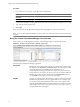
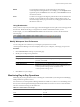
Table Of Contents
- VMware vCenter Operations Manager Enterprise Getting Started Guide
- Contents
- VMware vCenter Operations Manager Enterprise Getting Started Guide
- Introducing vCenter Operations Manager Features and Concepts
- Designing Your Workspace
- Using and Configuring Widgets
- Edit a Widget Configuration
- Configure Widget Interactions
- Advanced Health Tree Widget
- Alerts Widget
- Application Detail Widget
- Application Overview Widget
- Configuration Overview Widget
- Data Distribution Analysis Widget
- Generic Scoreboard Widget
- GEO Widget
- Health Status Widget
- Health Tree Widget
- Health-Workload Scoreboard Widget
- Heat Map Widget
- Mashup Charts Widget
- Metric Graph Widget
- Metric Graph (Rolling View) Widget
- Metric Selector Widget
- Metric Sparklines Widget
- Metric Weather Map Widget
- Resources Widget
- Root Cause Ranking Widget
- Tag Selector Widget
- Top-N Analysis Widget
- VC Relationship Widget
- VC Relationship (Planning) Widget
- Introducing Common Tasks
- Logging in and Using vCenter Operations Manager
- Monitoring Day-to-Day Operations
- Handling Alerts
- Optimizing Your Resources
- Index

Events and Faults Pane
This pane appears in the lower third of the Resource Detail page when you click Faults in the Status pane. You
can expand this pane to view a graph of faults. If an administrator configures it, the graph shows corresponding
events that might affect the selected resource. You can use the icons at the top of the pane to change the display.
Storage and Network Pane
For objects that have storage and network resources, this pane shows basic storage-related metrics. The pie
chart uses both volume and color to present information. The volume of the pie chart represents the amount
of used disk space. The color coding visualizes the nearness of the moment when disk space is exhausted.
Understanding Health Symptoms
A symptom is a metric that contributes to the health state of an object. For a global resource, you view health
symptoms in the Root Cause Ranking pane on the Resource Detail page. For a virtual resource, you view health
symptoms in the Metric Details pane on the Resource Detail page.
The Resource Detail page lists symptoms by child resource kinds. The parentheses after the resource kind name
contain information about the number of symptoms that are violating their thresholds for the resource group.
Figure 4-2. Example of a Symptom Group
The example shows a portion of the type of information that you might see when you view health symptoms
for a virtual machine. Virtual Machine (14 out of 18 Symptoms) indicates that 14 of the 18 metrics that
contribute to the health of the virtual machine are violating their thresholds.
Metrics that are violating their thresholds appear in metric groups. The parentheses after a metric group name
contain the number violations for the metrics in the metric group. In the example, Datastore (1 of 1) indicates
that the virtual machine has a threshold violation for the Datastore metrics group, Memory (1 of 1) indicates
that the virtual machine has a threshold violation for the Memory metrics group, and so on.
When you expand a metrics group, the list of metrics that are violating their thresholds appears. In each metric
row, you can check the percentage of objects that have threshold violations for the metric. A vertical blue line
represents the point in time when the first symptom became active.
Figure 4-3. Example of an Expanded Symptom Group
In the example, the metrics that are violating their thresholds in the Datastore metrics group are Datastore:
Aggregate of all instances | and Datastore:50 | Used Space (GB).
The icons in a metric row add information about the metric values that the row contains. When you point to
an icon, a tooltip appears that describes the meaning of the icon. In the example, the first icon is Below dynamic
threshold, which indicates that the metric value is below the dynamic threshold. The second icon is Active
Anomaly Exist, which indicates that the health symptom is still active. You can double-click a metric row to
view details about the selected symptom.
Chapter 4 Introducing Common Tasks
VMware, Inc. 79