
1.0
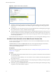
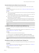
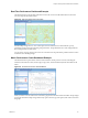
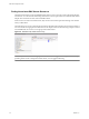

Table Of Contents
- EMC Smarts Integration Guide
- Contents
- EMC Smarts Integration Guide
- Updated Information
- Introduction to EMC Smarts Integration
- Installing the EMC Smarts Adapter
- Configuring EMC Smarts Integration
- Viewing Alerts and EMC Smarts Information
- Troubleshooting the EMC Smarts Adapter
- Index

Real-Time Performance Dashboard Example
This dashboard shows the real-time performance of the CPU use and overall health metrics for all of the
resources imported from EMC Smarts.
Figure 4-4. Real-Time Performance Information
Each Heat Map widget shows a color-coded square for each defined resource. Red indicates a poorly
performing resource and green indicates good performance. The predominate color of the widget indicates
the overall performance of the metric.
You can click a resource square to show the root cause metrics for the performance problems of that resource
in the Root Cause Ranking widget.
Metric Performance Charts Dashboard Example
This dashboard shows performance charts for selected metrics for the previous six hours, including the
minimum and maximum values, the moving average value, and the calculated dynamic thresholds for the
metric.
Figure 4-5. Performance Charts for Selected Metrics
When you select a resource and metrics on the left, a graph shows the metric data in the Metric Graph widget
on the right. The Metric Graph widget offers many options of chart type, time period, and what to include on
the graph.
Chapter 4 Viewing Alerts and EMC Smarts Information
VMware, Inc. 35