
User`s manual


SPC Chart Display:
Typical Features
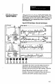
Figure 8.2 shows how the SPC display might appear when
your SLS is set up as described under Staging SLS For SPC
Data Displays, and you have started an SPC operation. It is
intended to give you a general idea of how a typical SPC
chart display looks.
Figure 82 SPC Chart Display: X Bar and R and Histogram
The graphic data “pans” across the display from left to
right; that is, the data display begins at the left chart
boundary and moves toward the right boundary. When the
data display reaches the right boundary, the display is
cleared, and the data display begins again at the left
boundary. This process continues as long as the SLS is in
operation and the SPC operation remains selected.
8-5