
User guide


AirMagnet Spectrum XT User Guide
Chapter 7: Analyzing WiFi Data 99
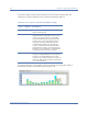
Channel Utilization
The Channel Utilization graph shows the percentage of bandwidth being used on each
channel and the breakdown of the utilization by transmission rate. The X-axis shows all
available channels for the selected radio band as well as the transmission rates being used on
each channel; the Y-axis shows the overall percentage of bandwidth being used on each
channel. See Figure 7-11.
Figure 7-11: Channel Utilization graph
Each bar in the Channels Utilization graph represents the percentage of bandwidth being
used on each channel. It also shows the breakdown of the utilization by transmission rate. The
various transmission rates are coded, as described in Table 7-7.
If you place the cursor over a channel, a tip screen will pop up showing the breakdown of
channel bandwidth utilization by transmission rate. See Figure 7-12.
Table 7-7: Color Scheme for Channel Utilization Graph
Color Transmission Rate (in Kilobytes)
Blue .11nM (for all 802.11n transmissions)
Orange 36~54
Green 12~24
Yellow 11
Aqua 2~9
Red 1