
User guide


94 Chapter 7: Analyzing WiFi Data
AirMagnet Spectrum XT User Guide
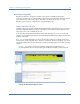
Channel Occupancy Graph
The Channel Occupancy graph shows all the available channels for the selected radio band
and which APs are occupying which channels. See Figure 7-5.
Figure 7-5: Channel Occupancy graph
As seen from the illustration above, each column in the Channel Occupancy graph represents
a channel in the selected radio band, and each row represents an AP that has been detected.
The fields are marked by four different colors that convey their designated meanings, as
described in Table 7-2.
Based on the information presented on the screen, the user can then reallocate their APs to
optimize their performance. The information is very helpful for making AP channel allocation
decisions to optimize AP performance.
Table 7-3: Channel Occupancy Graph Color Scheme
Color Data
Red Center frequencies of APs identified by name or SSID.
The dark shade of red indicates strong AP signal
strength.
Light Red Center frequencies of APs identified by name or SSID.
The light shade of red indicates that weak AP signal
strength.
Yellow Channels affected by the modulated inference from APs
in the center frequencies.
Light Yellow Channels affected by unmodulated interference from
APs in the center frequencies.