
Application Guide


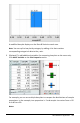


Raw data
Summary table for eye color based on raw data
• Raw data consists of a single list, such as a list of eye colors. When you create a
plot of raw data, Data&Statistics counts the occurrences for you. Plotting raw
data directly gives you flexibility in analyzing it.
• A summary table consists of two lists, such as eye colors (the XorYList) and
counts of eye-color occurrences (the Summary List). For more information, see
Using Lists&Spreadsheet chapter.
Working with Numeric Plot Types
Plots can represent the data from a variable in a variety of ways. Choosing the
appropriate plot can help you visualize the data. For example, you may be able to
observe the shape and spread of the data in one plot type and another type may be
useful for determining the best method for statistically evaluating data.
Creating Dot Plots
Dot plots, also known as dot-frequency plots, represent one-variable data. Dot plots are
the default plot type for numeric data. When you plot a variable as a dot plot, one dot
represents each value in the list. Each dot displays on the axis at a point that
correspond to the value.
1. To create a dot plot, click the Add Variable region in the center of an axis and click
the name of a numeric variable. For more information, see Plotting Variables.
2. (Optional) To split a dot plot by category, click the Add Variable region on the other
axis and choose the list that contains the corresponding category data.
3. (Optional) To plot multiple dot plots, choose Add X Variable on the Plot Properties
menu and click a numeric variable from the list that displays.
A second dot plot appears on the work area and the name of the plotted variable is
added to both axis labels.
4. Explore the plotted data.
- Hover over a data point to display data values.
Data&Statistics Application 351