
Operation Manual

Training Catalyst
- 6 - October 30, 2013
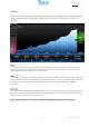
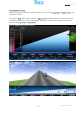
Program display
The display of the program at the top of the screen may differ depending on the chosen training type.
In a Slope/Distance program the course is displayed as a ‘mountain profile’. In the other types you
will see bars with the route setting on top of them. The width of the bar depends on the duration or
distance of the route. The vertical line is the position line. While cycling the bars will slip away to the
left. At the same time the bars to the left of the position line will change colour.
Graph
When you are cycling the training data are drawn in a graph. Standard visible data at every start are
Speed, Power output, Cadence and Heart rate. You can switch these lines Off or On by clicking the
mouse on the vertical axis scale.
The graph shows the set Heart rate limits by a dotted line. Right of the graph you can see the values
of the parameters and the time.
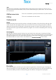
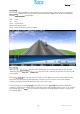
Training data
At the bottom of the screen the values of the training data are displayed:
Speed
Current speed *
AVS average speed
MAX maximum speed
Cadence
Current pedalling frequency
AVS average pedalling frequency
MAX maximum pedalling frequency
Power
Current power output *
AVS average power output
MAX maximum power output
Heart rate
Current heart rate *
AVS average heart rate
MAX maximum heart rate
Route setting
Slope, Watt or Heart rate setting
The setting’s average
The setting’s maximum
Distance
Trip distance