
User Manual


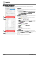
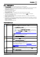
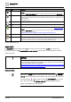

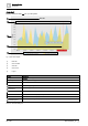

Table Of Contents
- 1 About this document
- 2 Commissioning
- 2.1 Default connection
- 2.2 Initial login
- 2.3 Setup wizard
- 2.4 Discover and assign devices
- 2.5 Subscribing to the time master
- 2.6 Time synchronization of the time master
- 2.7 Registering as a foreign device
- 2.8 Touch panel settings
- 2.9 Operating and monitoring features
- 3 Data point integration
- 4 Graphic features
- 4.1 Plant view Tools
- 4.2 Kiosk graphics
- 4.3 Engineering notations
- 5 Graphics Builder
- 5.1 Overview
- 5.2 Pane tools
- 5.3 Graphics libraries
- 6 Graphics engineering
- 6.1 Using supersample graphics
- 6.2 Optimizing graphics for PXM touch panels and standard devices
- 6.3 Thumbnails
- 6.4 Dashboards
- 7 Advanced functionality
- 8 Tips and tricks
- 8.1 Updates required after a time zone change
- 8.2 APPLY BATCH TAGS
- 8.3 Graphic components within models cannot be modified
- 8.4 A graphic with relative binding that includes data points from different branches of the hierarchy cannot be created at the Root level
- 8.5 Relative hyperlinks cannot be added to a graphic at the Root level
- 8.6 Relative hyperlinks in a graphic are broken if the graphic is engineered offline and then imported to another device
- 8.7 Automatic logout from Desigo Control Point causes Graphics Builder to temporarily stop working
- 8.8 Detection of network interruptions
- 8.9 Cancelling a kiosk log out sequence
- 8.10 Special characters do not display in graphic file names
- 8.11 The color of a graphical component may display incorrectly if the component was copied
- Index

Graphics Builder
Pane tools
5
A6V11604297_en--_g
73 | 195
BORDER
Adds a border to the selected component.
● Enter a point value in the WIDTH field and select a line TYPE from the
drop-down list.
● Select to change all borders at once.
● Select , or to change individual sections of the border.
● Click the COLOR field to open the palette. Select a color and click the
COLOR field again to save your selection.
● Use the RADIUS field to change the appearance of the corners of the
selected component.
ROTATION
Use the slider or select an option from the drop-down menu to rotate the
selected component.
DROP SHADOW
Adds a drop shadow to the selected component.
● Enter a point value in the HORIZONTAL and VERTICAL fields and
select a shadow TYPE from the drop-down list.
● HORIZONTAL and VERTICAL
Determine if the position of the shadow. For example, a shadow can
display to the right or left and above or below the selected component.
● BLUR
Changes the edges of the shadow.
● SPREAD
Changes the size of the shadow.
● Click the COLOR field to open the palette. Select a color and click the
COLOR field again to save your selection.
● Form field
Specifies an HTML form that the component belongs to. Using this field
is an advanced task.
● Text field
If the selected component is a Label , the label text displays in this
field.