
User Manual


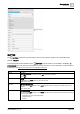


Table Of Contents
- 1 About this document
- 2 Commissioning
- 2.1 Default connection
- 2.2 Initial login
- 2.3 Setup wizard
- 2.4 Discover and assign devices
- 2.5 Subscribing to the time master
- 2.6 Time synchronization of the time master
- 2.7 Registering as a foreign device
- 2.8 Touch panel settings
- 2.9 Operating and monitoring features
- 3 Data point integration
- 4 Graphic features
- 4.1 Plant view Tools
- 4.2 Kiosk graphics
- 4.3 Engineering notations
- 5 Graphics Builder
- 5.1 Overview
- 5.2 Pane tools
- 5.3 Graphics libraries
- 6 Graphics engineering
- 6.1 Using supersample graphics
- 6.2 Optimizing graphics for PXM touch panels and standard devices
- 6.3 Thumbnails
- 6.4 Dashboards
- 7 Advanced functionality
- 8 Tips and tricks
- 8.1 Updates required after a time zone change
- 8.2 APPLY BATCH TAGS
- 8.3 Graphic components within models cannot be modified
- 8.4 A graphic with relative binding that includes data points from different branches of the hierarchy cannot be created at the Root level
- 8.5 Relative hyperlinks cannot be added to a graphic at the Root level
- 8.6 Relative hyperlinks in a graphic are broken if the graphic is engineered offline and then imported to another device
- 8.7 Automatic logout from Desigo Control Point causes Graphics Builder to temporarily stop working
- 8.8 Detection of network interruptions
- 8.9 Cancelling a kiosk log out sequence
- 8.10 Special characters do not display in graphic file names
- 8.11 The color of a graphical component may display incorrectly if the component was copied
- Index

Graphics Builder
Pane tools
5
A6V11604297_en--_g
105 | 195
BUTTON
The BUTTON component is typically used to start an action within a graphic. This is the HTML button
element (<button>).
The following table outlines attributes of the BUTTON component that can be modified in the BASIC
PROPERTIES pane. The minimum requirement is to specify an action. For more information on this element or
its attributes, visit https://www.w3schools.com/tags/tag_button.asp.
Attribute
Description
Disabled
Disable the component
Switch OFF to enable the component. Switch ON to disable the component.
Default: OFF
Form
Form ID
The ID attribute of a <form> element in the same document.
Default: Field is blank
Formaction
URL for sending form data
Only valid when the Type attribute is set to submit. Specifies a URL for sending the form data when a form is
submitted.
Default: Field is blank
Formenctype
Form data encoding
Only valid when the Type attribute is set to submit. Specifies how form-data should be encoded before sending it
to a server. Options are:
● application/x-www-form-urlencoded (Default)
● multipart/form-data
● text/plain