
User Manual

Graphics Builder
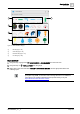
Pane tools
5
114 | 196
A6V11604297_en--_e
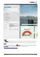
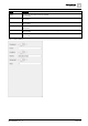
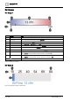
METER
The METER component is rendered as a simple bar. This is the HTML meter element (<meter>).
The following table outlines attributes of the METER component that can be modified in the BASIC
PROPERTIES pane. You can also drag and drop a virtual point onto the METER to display a specific
point’s curVal as the value property. For more information on this element or its attributes, visit
https://www.w3schools.com/tags/tag_meter.asp.
Attribute
Description
High
Number range that is considered to be a high value.
Low
Number range that is considered to be a low value
Max
Maximum value of the range.
Min
Minimum value of the range.
Optimum
Optimal value for the gauge.
Value
Current value of the gauge. This field is required.
Table 39: METER attributes.
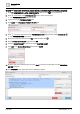
PROGRESS BAR
The PROGRESS BAR component is similar to the meter bar. This is the HTML progress element
(<progress>).
The following table outlines attributes of the The PROGRESS BAR component that can be modified in the
BASIC PROPERTIES pane. You can also drag and drop a virtual point onto the PROGRESS BAR to
display a specific point’s curVal as the value property. For more information on this element or its attributes, visit
https://www.w3schools.com/tags/tag_progress.asp.
Attribute
Description
Max
Specifies how much work the task requires in total.
Label
Value
Specifies how much of the task has been completed.
Table 40: PROGRESS attributes.
SELECT
The SELECT component is used for a drop-down list. The options that populate the list need to be supplied
by a program. These can be the results of a query to the FINstack database using finstack.eval or a hard-coded
list supplied in the function. This is the HTML drop-down list (<select>).
The following table outlines attributes of the SELECT component that can be modified in the BASIC
PROPERTIES pane. For more information on this element or its attributes, visit
https://www.w3schools.com/tags/tag_select.asp.