
User Manual
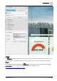

Graphics Builder
Pane tools
5
112 | 196
A6V11604297_en--_e
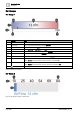
Attribute
Description
autocomplete
Enable autocomplete
Enables autocomplete for the <input> element. Options are:
● On
● Off
autofocus
Autofocus switch
On = Autofocus is enabled for the <input> element when the page loads.
disabled
Disabledswitch
On = the <input> element is disabled.
form
Form field
Specifies one or more forms the <input> element belongs to. Enter the form_id for each form.
formnovalidate
Formnovalidate switch
Defines that form elements should not be validated when submitted.
maxlength
The maximum number of characters allowed in an <input> element.
name
Text field for the name of an <input> element.
pattern
Regular expression (regexp) that an <input> element's value is checked against.
placeholder
A short description for the expected value of an <input> element.
readonly
Readonlyswitch
On = The input field is read-only.
required
Required switch
On = an input field must be completed before submitting the form.
size
Element size
The width, in characters, of an <input> element.
type
Type of <input> element
Options are:
● button
● checkbox
● color
● date
● datetime-local
● email
● file
● hidden
● image
● month
● number
● password
● radio
● range
● reset
● search
● submit
● tel
● text
● time
● url
● week
value
Value text field
The value of an <input> element.
Table 37: INPUT attributes.
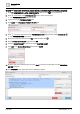
Creating a text input that will attempt to auto-complete and has placeholder text of
Enter text
here
1. From the COMPONENTS > HTML COMPONENTS pane in Graphics Builder, drag-and-drop onto
the work area and then select it.
2. In the BASIC PROPERTIES pane for the INPUT component, set the placeholder attribute to Enter
text here.