
User Manual


Graphics Builder
Pane tools
5
A6V11604297_en--_e
105 | 196
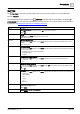
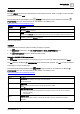
BUTTON
The BUTTON component is typically used to start an action within a graphic. This is the HTML button
element (<button>).
The following table outlines attributes of the BUTTON component that can be modified in the BASIC
PROPERTIES pane. The minimum requirement is to specify an action. For more information on this element or
its attributes, visit https://www.w3schools.com/tags/tag_button.asp.
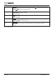
Attribute
Description
Disabled
Disable the component
Switch OFF to enable the component. Switch ON to disable the component.
Default: OFF
Form
Form ID
The ID attribute of a <form> element in the same document.
Default: Field is blank
Formaction
URL for sending form data
Only valid when the Type attribute is set to submit. Specifies a URL for sending the form data when a form is
submitted.
Default: Field is blank
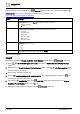
Formenctype
Form data encoding
Only valid when the Type attribute is set to submit. Specifies how form-data should be encoded before sending it
to a server. Options are:
● application/x-www-form-urlencoded (Default)
● multipart/form-data
● text/plain
Formmethod
HTTP method for sending form data
Only valid when the Type attribute is set to submit. Specifies how to send the form-data. Options are:
● get (Default)
● post
Formnovalidate
Validate form data on submission
Only valid when the Type attribute is set to submit. Switch OFF if the form data should not be validated. Switch
ON if form data should be validated.
Default: OFF
Formtarget
Form target
Only valid when the Type attribute is set to submit. Specifies where to display the response after submitting the
form. Options are:
● _blank (Default)
● _self
● _parent
● _top
● framename
Name
Name of the BUTTON component
Not supported in HTML5.
Default: Button
Label
Text displayed on the BUTTON component
Default: Submit