
User Manual

Operating Reference
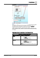
Graphics Viewer
3
198 | 352 A6V10415471_en_a_40
● Non-engineered elements: The connection point aligns itself to the center of
the element.
● Symbols: The connection point aligns itself to the center of the first element in
the symbol, according to the element tree.
● Customized Connection Point: You can create a connection point location by
drawing an ellipse where you want to anchor the connection point for the
symbol. In the Ellipse Descriptor field, you can enter text stating it is an Anchor
for the Connection Point. To hide the ellipse from view, either cover it up by
another element (preferred method) or disable the Visible property for the
element in the Property tree. In both cases, make sure that the ellipse is the
first element in the Symbols element tree in the Element view.
For graphics and graphic templates only, you can specify the maximum number of
connection lines to display. The default value of 65535 is used when the property
Graphics > Max Connection Lines is left blank, in which case under normal
circumstances all lines display with the Status and Commands window. If the
actual number of connection lines associated with a Status and Commands
window exceeds the number of connection lines specified in this property, then
none of the lines display.
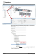
Drag-and-Drop
The Status and Commands window is a drag source for data point properties.
When the Status and Commands window is expanded, you can drag a data point
or one of its properties from the window to any of the drop targets in the Graphics
Editor or other applications. You cannot drag-and-drop virtual data point properties,
such as those properties that display No Properties or Not Available.
● Evaluation Editor: When you drop a data point property in the Expression field
of the Graphics Editor’s Evaluation Editor, the current value of the property
displays in the Result field for the element’s property.
● Ribbon: When you drop a data point property onto the ribbon, all the graphics
associated with that data point display as tabbed graphics in the work area.
● Graphic Canvas: When you drop a data point property onto the canvas, the
associated data point symbol displays on the graphic.
For a list of the drop sources in the Graphics Editor, see the Table of Graphics
Drop Targets.
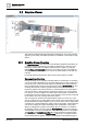
Tooltips
Tooltips are customizable properties that display as a yellow text box when you
mouse-over an element or object on the active graphic. The text box for a tooltip
contains descriptive text, the current value of the graphic object, and the names of
the associated objects based on the view selected in System Browser. When you
move your cursor over an object or element on the active graphic, an associated
tooltip displays.
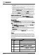
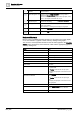
Tooltips
Name Description
1
Static tooltip Descriptive text entered into the tooltip property field that is
associated with the general category in the Property Viewer.
2
Dynamic tooltip Current tooltip text based on a tooltip evaluation, and the current
field values. Evaluations are created in the Evaluation Editor.
3
Static link reference and
link description
The name and description of the file linked to the element as
entered in the Link Reference and Link Description fields from
the Commands category in the Property Viewer.
4
Dynamic link reference
and link description
The name and description of the associated link resulting from
any evaluations on the Link Reference and Link Description
fields. The text displayed depends on the current field values.
Evaluations are created in the Evaluation Editor.
5
Data point references The names of the objects and the System Browser view the
name is based on. One line entry per object.