
Home Theater Server User Manual

Chapter 11 - FINlite Graphics Tool
FINlite Graphics Tool Overview
143
Siemens Industry, Inc.
125-3584T
The Delete Layer button deletes the highlighted layer.
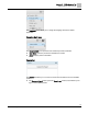
Properties Bar
Clicking a component in the canvas on the right side of the application, and opening
the Properties bar in the left navigation pane opens the Properties area for the specific
component. Each type of component has different customizable properties.
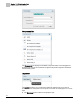
Opening the Properties bar with nothing on the canvas allows you to customize the
size and background color of the canvas itself.
Customizable properties include, but are not limited to:
Name of the component.
Type of component.
Object the component is bound to.
Font size and color of labels.
Width and Height of the component.
Background color and alpha (transparency) level.
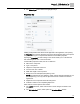
NOTE: The background color defaults to white, and the alpha level defaults to 100
(no transparency). You may need to adjust these levels to achieve the desired
appearance.
Alignment of the component within the background.
Invisible or visible on the completed graphics file.
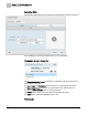
Other features of the Properties area include:
The Locked check box, which ensures that no other changes are made to the
properties.
The Edit Animation button, which opens the Animation Editor window.