
User's Manual

49
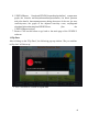
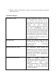
2. Return: Click on this button to return to the test report without saving the
notes made here.
6.VENDYS
®
Report
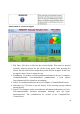
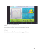
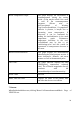
Temperature Graph: Displays temperature graph of VENDYS
test. Thelegend above indicates that the
right bold line isthe right hand, and the
blue bolded line is the left.The green line
indicates the zero reactivity
curve,theexpected temperature increase if
there was novasodilation. The red
vertical lines separate thedifferent phases
of the test. The red horizontallines mark
the minimum temperature reached andthe
start temperature at the time of inflation.
Directly above the graph is the filename
that willappear in the list of studies in the
completed test viewer
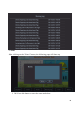
Warning Flags: Displays any warning flags that may
have beenraised in red. (Please refer
tothe“Descriptions ofWarning
Flags”section.)
Adjusted Reactivity Curve: This temperature graph displays the
adjustedcurve of the difference between
the zero reactivitycurve and the observed
temperature rebound inthe occluded arm.
The final report aTR is themaximum
value in this graph.
Vascular Reactivity Index: Displays a general reading of
cardiovascular healthbased on the level
of the final aTR value: an aTRbelow 1 is
considered to show poor
cardiovascularreactivity, whereas an aTR
of between 1 and 2 isconsidered
intermediate, and an aTR of more than2
is considered healthy.