
Operation Manual


Web Design from Scratch 87
Page Layout
As long as people are still reading Web pages, as opposed to watching
them or listening to them, everything you’ve been taught about editorial
style and text organization has relevance—so don’t throw away that old
style manual! Readers respond to good design and clear, concise
writing. They’ll respect the fact that you understand the proper way to
tell a story or convey an idea: the relation of headlines to body text, the
use of subheads, and so on.
Still, compared to a print publication, the computer screen is a like a
rectangular hole through which users must peer at information. Will
users be inclined to scroll down and retrieve what has disappeared off
the bottom? Reading skills like scanning headlines or skimming stories
become less relevant when content is segmented into separate
screenfuls. And even the most computer-literate first-time visitor to
your Home page will have no idea how many pages there are or how
the pages are organized.
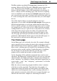
Browser Window
(“safe area”)
Page
The Web page viewer initially sees only what’s displayed in the
browser window (the safe area, after the television concept of a “safe
title” area), leaving unseen an indeterminate portion of the page below
that. At 800x600 resolution, the safe area may be around 400 vertical
pixels of actual page height. Content in this region may be all the
visitor sees for several seconds as various graphics load onto the page.
In fact, studies show that many Web users are not in the habit of
scrolling pages before deciding to move on, so that leaves a fairly
narrow strip and a short interval in which to grab their attention!
♦ Content. The safe area should convey essential information about
the site and entice the visitor to scroll for more.
♦ Composition. Think of the safe area as a mini-page, and make
sure that the elements within it work as a group.