
Operation Manual


Tables, Charts, and Calendars 95
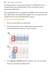
types, base your chart on different ranges, and toggle series as row or
columns.
Editing titles
To edit your chart title:
• Click on the chart title and begin typing.
Formatting and styling charts
To display the Charts tab:
• At the bottom of your right-hand tab group, click Charts.
The tab offers three buttons called Chart, Axes, and Series.
• Chart: Used for title and series legend control and positioning.
Other options are the same as provided on the Chart context
toolbar.
• Axes: The Axes section adds axis-specific titles, labels, guides, and
any other chart elements that aid the interpretation of chart data.
• Series: Modifies individual series, including manually assigning
series labels, series plotting, enabling trend lines, error bars, and
value labels.
For an easy way to transform your chart's appearance in one click, you
can use the Styles tab.
To apply a style to your chart:
1. On the Styles tab, select the Charts category from the drop-down
list.
2. Click on a style preset thumbnail.