
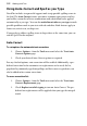
Operation Manual


Working with Text 105
• Small Caps/Petite Caps
A small cap "A" should use a special glyph,
which typically looks like a capital "A", but is
shorter, but has the same stem widths etc. as
the capital, so it can't be achieved by just
scaling the capital. Petite caps are like small
caps but even smaller.
•
Case sensitive forms
These are variants of punctuation such as
brackets that, for example, are designed to
align more nicely with capitals. These would
generally sit a little higher in the line, because
most capitals don’t have descenders.
•
Superscripts and subscripts
These are smaller raised or lowered versions
of characters; the scaling issues are the same
as for Small Caps. Some fonts also provide
Ordinals, which are a form of superscript
intended to be used for the letters in "2
nd
", or
forms that are intended to be used in
chemical or mathematical notation.
•
Fractions
In text like "1/3", the digits before the slash
are made smaller and raised, and the digits
after the slash are made smaller and may be
lowered. A special narrow version of the slash
may be used.
• Old style figures
These are digits that have a bit more
character (at right); they often sit lower in the
line. Compare with the more usual "lining"
figures that are more uniform (at left).