
Manual


Monitoring System Components
975-0679-01-01 Revision D 4–19
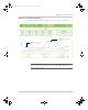
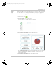
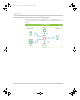
Interpreting a Generator Energy Graph
The below illustration shows an energy graph for April 15, 2013, comparing the total
generator input versus battery discharge for a site operating in a diesel cycle charging
application. The baseload was approximately 10-12 KW average throughout the day,
represented by the blue bars. The orange bars represent the total energy from the
generator to power the loads and charge the batteries again.
Observation #1: Shows that
around 4pm, the generator
was turned on and kept
running until 10pm.
Important: This graph is based on a diesel cycle charging application and is
shown for illustration purposes only. Different systems perform variably and the
graph above may not be typical.
Conext_ComBox_Owners_Guide.book Page 19 Monday, October 21, 2013 10:00 AM