
Manual


Monitoring
4–18 975-0679-01-01 Revision D
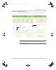
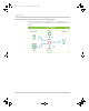
Interpreting a Solar Energy Graph 2
This graph compares energy that is stored by the system for a whole month from
harvesting solar energy (Series 1) versus energy that is used by the loads (Series 2).
Observation #1: The trend is representative
of a system that typically uses energy from
both the grid and solar.
Observation #2: The differences between
solar energy input versus energy
consumption by the loads indicate that
during these times, the sun was yielding
less energy and the system was relying
heavily on energy from the grid. Where the
blue bar exceeds the orange bar, it means
energy consumption by loads exceeds the
PV yield.
Important: This graph is from a solar grid-tied backup system and is shown for
illustration purposes only. Different systems perform variably and the graph
above may not be typical.
Conext_ComBox_Owners_Guide.book Page 18 Monday, October 21, 2013 10:00 AM