
User`s guide


representation of point data (e.g. Cities) than a Ranged map does, and it uses sized symbols rather
than colors to distinguish variations in the values of the items it represents.
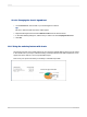
Pie Chart
A Pie Chart map displays a pie chart over each geographic area. The pie charts represent data items
that make up a whole. Each slice of the pie represents an individual data item and shows that item's
percentage in the whole. For example, you could create a Pie Chart map showing heating fuel types
by region. You might have four types of heating fuel (four slices in each pie): electricity, gas, wood, and
solar. Each region would then have a pie chart showing the breakdown of heating fuel types within that
region. Washington state would probably use a high percentage (a large slice of the pie) of electricity
because of the hydropower in that region, while Idaho would probably use a high percentage (a large
slice of the pie) of natural gas.
You can use this map type to compare the distribution of several items within a particular region. You
can also specify that the pie charts be sized proportionately so that, as with the symbols in a Graduated
map, the pie charts will appear in various sizes, depending on the underlying data values. This will allow
you to compare the totals between regions.
Bar Chart
A Bar Chart map works like a Pie Chart map, but may be more useful for certain sets of data. Typically,
you would use a Bar Chart map for items that do not total 100%; that is, for data items that do not make
a whole, or for data items that are unrelated. For example, you could create a Bar Chart map that
displays use of heating fuel by region. You might choose to analyze use of three types of fuel: electricity,
gas, and solar. Each bar chart on the map could contain individual bars for each of these types. In this
example, the data items (electricity, gas, and solar) do not comprise a whole. There may be other types
of fuel used in these regions, such as wood, but this map only focuses on three of them. Also, the
purpose of the map is to compare each region's use of each fuel type with that of every other region.
In a Pie Chart map, you could show these three fuel types as percentages of the entire fuel use within
each region, and though you could compare the percentages for each region, you would probably not
be able to compare the actual values for each region because each region would have the same total
value (100%).
13.1.4 Where to place a map
When you choose where to place the map, you determine the amount of data that will be included in
the map. For example, if you place the map in the Report Header section, the map includes data for
the entire report. If you place it in a Group Header or Group Footer section, it displays group-specific
data. This choice will also determine whether the map prints once for the entire report, or many times
(once for each instance of a given group).
Note:
If your report contains subreports, you can place maps in those subreports as well.
2012-03-14288
Mapping