
User`s guide


• Equal count
This option assigns intervals in such a way that the same number of regions (or as close to the same
number of regions as possible) appear in each interval. In other words, this option would assign
intervals so that each color on the map is assigned to the same number of regions. The numeric
quantity of the summary values in each interval may or may not be equal, depending on the individual
regions and their summary values.
• Equal ranges
This option assigns intervals in such a way that the summary values in each interval are numerically
equal. The number of regions in each interval may or may not be equal, depending on the individual
regions and their summary values.
• Natural break
This option assigns intervals using an algorithm that attempts to minimize the difference between
the summary values and the average of the summary values for each interval.
• Standard deviation
This option assigns intervals in such a way that the middle interval breaks at the mean (or average)
of the data values, and the intervals above and below the middle range are one standard deviation
above or below the mean. Standard deviation is the square root of the variance. It projects how
various values in a set of values deviate from the mean for that set.
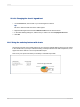
Dot Density
A Dot Density map displays a dot for each occurrence of a specified item. For example, you might
create a United States map that shows one dot for each shipbuilder in the nation. In states like
Tennessee, there would be no dots. However, in some coastal states, such as South Carolina, you
might be able to count the dots on the map, since their dispersal would be fairly wide.
The purpose of a Dot Density map is to provide an overall impression of the distribution of the specified
item. A Dot Density map is much like a nighttime satellite photo of the United States, where you can
see the lights of all the cities. Such a map is not a very accurate means of communicating information
(particularly if you have a large number of items), but it is a good way to give an overview of the
distribution.
Graduated
A Graduated map is much like a Ranged map; it shows one symbol per instance of a specified item.
This symbol is a circle by default, but you can choose a different symbol if you prefer. Each symbol is
proportional in size to the value of the item it represents (within a range of three sizes).
A Graduated map communicates the same information as the Ranged map, but you would usually
create a Ranged map for a case in which the geographic areas have distinct geographic boundaries
(as in the case of Regions), while you would use a Graduated map for displaying data that is linked to
points rather than precise areas (as in the case of Cities).
For example, a map of an individual region could use graduated circles to represent the sales for each
office. The size of each circle would be proportional to the sales (or to the sales range) of the office it
represents. On this map, an office with a sales figure of $70,000 might have a large circle, and an office
with a sales figure of $20,000 might have a small circle. So, a Graduated map provides a more efficient
2012-03-14287
Mapping