
User guide

Racelogic Ltd PerformanceTools Software
02/05/2014 Page 56
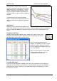
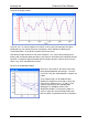
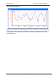
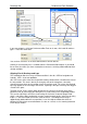
Result in the Graph window:
The main run (1:30.70 – the fastest lap from the previous example) is in red, the compare run
(1:26.10) in blue. Note in this instance how there are differences in the peaks and troughs of
the speed plots, indicating that the faster driver carried more speed before braking, and
accelerated harder.