
Designer Guide
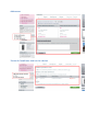


Make the "Add to Cart" button clear and visible. It must distinguish itself
from the rest of the layout, by both its size and color – but do keep a
homogeneous design: if the button is too far off from the general design,
the visitor can just as easily not see it, in the same way people have
trained themselves not to see ads on the Internet.
Make sure to display all the relevant labels: "New product", "Promotion",
"Voucher", etc. Also, do not forget to add the delivery delays.
The conversion funnel: "My Account" and related pages
The conversion funnel is where your visitors become client (hence the use
of "conversion", or sometimes "transformation"). If these pages are badly
designed or structured, this can mean the loss of many potential clients,
and therefore all the order they would have made on your site.
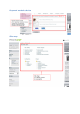
Account creation / "My Account"
The default PrestaShop theme comes with an account form that gives a
very good transformation percentage. But it might still not suit your own
site's needs. Hence, here are a few tips to follow if you intend to update
the form.
Be basic, keep the essential only. The visitor must concentrate on
the account creation, and the purchase. See how Amazon does it.
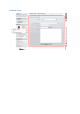
Reduce the number of steps. The user must know how many steps
she still has to go through before she can actually finalize her
purchase.
Clearly display any mistake the user makes, right next to form field.
Errors should be displayed in a distinct color (red is a favorite), and
mandatory fields should indicated (with an asterisk *, for instance).
Payment
The visitor has created her client account, great! But it's still not over yet,
she must now go through the purchase itself.
Same as for the account creation form:
Reduce the number of steps (delivery address, payment page).
Display the errors in a distinct color.
Payment page:
o if the visitor uses a credit card, warn them that they will be
redirected to your bank's secure server. For instance, add a
little padlock icon, with an explanation
o if she chooses to pay by check (or any other offline payment
method), clearly mention what to do next: amount, address,
etc.