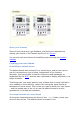
PrestaShop Designer Guide The default PrestaShop install offers a neutral theme in shades of gray, enabling sellers to quickly and freely start their activity, whatever their business line. More than 700 themes are available through the PrestaShop Addons marketplace. They were created either by the PrestaTeam or the PrestaShop community, and are sold at reasonable prices – some even free.
All themes have their files located in the /themes root folder. Each theme has its own sub-folder, in the main themes folder. Each theme is made of template files (.tpl), image files (.gif, .jpg, .png), one or more CSS files (.css), and sometimes even JavaScript files (.js). Each theme has a preview.jpg image file in its folder, enabling the shop-owner to see what the theme looks like directly from the backoffice, and select the theme appropriately.
{l s='My Text'} This will enable anyone to translate the theme into his own language, using the internal translation tool, which you can find in the PrestaShop back-office, under the "Tools" tab and its "Translation" sub-tab. In the "Modify translations" section, use the drop-down menu, choose "Front Office translation", then click on the flag of the language you wish to translate strings into. All the front-office strings will then be displayed.
6. Always make sure to produce a clear and readable code, making it easy to maintain for anyone. 7. Do comment your code, in English. 8. When editing the theme on a production site, always first put the shop in maintenance mode via the back-office. 9. Use modern browsers, such as Firefox, Google Chrome or Opera, and make sure your friends do too. 10. Whenever possible, use CSS sprites (follow-up article). 11.
Where possible, use CSS instead of HTML (e.g., only use tables for tabular data, not for layout). Validate your XHTML and CSS code using the W3C tools: HTML validator, CSS validator. Reduce images and pictures size by using compression. Yahoo!'s SmushIt is an excellent tool for that. Test your theme on several Web browsers, not only Internet Explorer.
Share your themes! Show off your hard work, get feedback, and build your reputation by sharing your theme in the Themes section of our Forum! You can also sell your theme to PrestaShop users through our Addons website! Creating your own theme PrestaShop's default theme The default theme was conceived in a neutral style, and as such can be use for just about any type of shop, independent of the industry.
/themes/prestashop sub-folder. This is the folder from which you will build your own theme. That being said, it is highly discouraged to directly change the files for the default theme, the reason being that this could introduce news bugs and no way to go back. You need to keep the default theme intact, so that you can switch between your theme and the default one in order to find out if the issue you are seeing is tied to your theme, or to a bug in another part of PrestaShop.
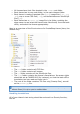
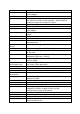
errors.tpl footer.tpl guest-tracking.tpl header.tpl history.tpl identity.tpl index.php index.tpl maintenance.tpl manufacturer.tpl manufacturerlist.tpl my-account.tpl new-products.tpl order-address.tpl order-carrier.tpl orderconfirmation.tpl order-detail.tpl order-follow.tpl order-opc.tpl order-opc-newaccount.tpl order-payment.tpl order-return.tpl order-slip.tpl order-steps.tpl pagination.tpl password.tpl prices-drop.tpl product.tpl product-list.tpl client. Used when displaying errors.
product-sort.tpl productscomparison.tpl scenes.tpl search.tpl shopping-cart.tpl shopping-cartproduct-line.tpl sitemap.tpl store_infos.tpl stores.tpl supplier.tpl supplier-list.tpl thickbox.tpl /cache /css /img /js /lang Used by all pages that list products. Displays a menu enabling to sort and filter products. ... Used to display a scene's details within a product category. Used to list results from a search query. Used to list products in a client's cart. Used to display from a single cart row.
preview.jpg file: Once your design is complete, you can create the preview image file. Take a screen shot, then resize it to 180px width in order to use it instead of the default preview.jpg file. You can either used the screenshot tool provided by your OS (Windows' Snipping Tool, OS X's Cmd+Shift+4 key combo), or install a browser extension, such as Firefox's FireShot or Screengrab.
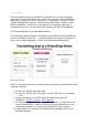
Hooks Main content areas Modules Header section
Homepage blocks
Category central column
Product page
Account forms & order steps Account creation form
Order blocks
Addresses Terms & Conditions and carrier choice
Payment module choice Site map
Contact form
Stores page Design tips Thinking ahead Before opening PhotoShop, GIMP or any other graphic editor, you should sit at a desk with a pen and a sheet paper, and think of your shop's
sitemap, making it as flexible as possible (not all shops have the same amount of categories, or of products per category).
Of course, these are just general tips; some professional might prefer to do it all directly in PhotoShop, then jump right into PHP, HTML and CSS. Technical recommendations In order to ensure that you can easily share your creation with others (designer, integrators, client), we advise you to save them as a PhotoShop file (RGB, 72 dpi, non-flattened). You should work with the 980px width resolution in mind.
Text size Always keep in mind that the user has the final say on the text say, as modern browser can expand or reduce it at will. As a matter of fact, you should test your website with various browser variations, see how easy it is break your design... and therefore rework your design in order to avoid such easy breakage. That being said, you may start off with a handful of basic text sizes: 10 to 12px for regular text 14px for sub-titles 18px for titles etc.
The home page This is the most important page of your shop, the one where it is "hit or miss". This is the page where the visitor will get a general opinion of your shop, and decide if she should trust you with her money. You should make sure to make your shop easily recognizable, and have your catalog be the first thing people see. The website's header is where you will be able to put the most recognizable details: logo, name, unique image...
Make the "Add to Cart" button clear and visible. It must distinguish itself from the rest of the layout, by both its size and color – but do keep a homogeneous design: if the button is too far off from the general design, the visitor can just as easily not see it, in the same way people have trained themselves not to see ads on the Internet. Make sure to display all the relevant labels: "New product", "Promotion", "Voucher", etc. Also, do not forget to add the delivery delays.
All these usability tips are just part of the whole story, but they can bring you a solid ground on which building your theme, in order to improve your shop.