
Writer Guide


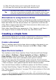


Form Control toolbar
Check Box
A box that can be selected or deselected on the
form. You can label the box.
Text Box
A control to create a box into which the form
user can type any text.
Formatted Field
A control allowing numeric formatting options.
For example, you can set maximum and
minimum values for the number entered, or the
number type (decimal places, scientific,
currency).
Push Button
Creates a button that can be linked to a macro.
The label is the name that appears on the
button.
Option Button
Creates an option button (also known as a
radio button). When multiple buttons are
grouped together, only one can be selected at a
time. The easiest way to group multiple buttons
is to use the Group Box button on the More
Controls toolbar, with wizards enabled.
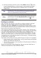
List Box
Creates a list of options as a pull-down menu
that the user can choose from. If wizards are
on, creating a list box launches the List Box
Wizard. This wizard is only useful if your form
is linked to a data source.
If the form is not linked to a data source, turn
wizards off and create an empty list box. Then
click the control button and, in the List Entries
option on the General tab, enter the options
you want to appear on the list.
Combo Box
As with a List Box, you set up a list of choices.
In addition, a panel at the top either displays
the choice made or allows the form user to type
in something else. This works the same as the
List Box.
Label Field
A text label. The difference between this and
just typing on the page is that, as a control, you
can link a label field to macros so, for example,
something happens when the mouse passes
over it or clicks on it.
More Controls
Launches the More Controls toolbar.
Chapter 15 Using Forms in Writer 479
Free eBook Edition