
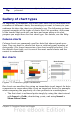
Calc Guide
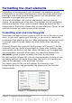
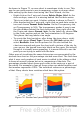

Line charts
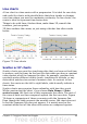
A line chart is a time series with a progression. It is ideal for raw data,
and useful for charts with plentiful data that show trends or changes
over time where you want to emphasize continuity. On line charts, the
x-axis is ideal to represent time series data.
Things to do with lines: thicken them, make them 3D, smooth the
contours, just use points.
3D lines confuse the viewer, so just using a thicker line often works
better.
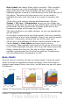
Figure 75: Line charts
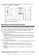
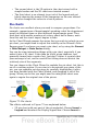
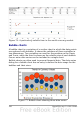
Scatter or XY charts
Scatter charts are great for visualizing data that you have not had time
to analyze, and they may be the best for data when you have a constant
value against which to compare the data; for example, weather data,
reactions under different acidity levels, conditions at altitude, or any
data which matches two series of numeric data. In contrast to line
charts, the x-axis are the left to right labels, which usually indicate a
time series.
Scatter charts may surprise those unfamiliar with how they work.
While constructing the chart, if you choose Data Range > Data
series in rows, the first row of data represents the x-axis. The rest of
the rows of data are then compared against the first row data. Figure
76 shows a comparison of three currencies with the Japanese Yen.
Even though the table presents the monthly series, the chart does not.
In fact the Japanese Yen does not appear; it is merely used as the
constant series that all the other data series are compared against.
Chapter 3 Creating Charts and Graphs 99