
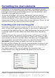
Calc Guide
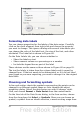
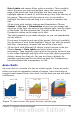
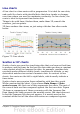

As shown in Figure 73, an area chart is sometimes tricky to use. This
may be one good reason to use transparency values in an area chart.
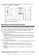
After setting up the basic chart using the Chart Wizard, do this:
• Right-click on the Y axis and choose Delete Major Grid. As the
data overlaps, some of it is missing behind the first data series.
This is not what you want. A better solution is shown in Chart 2.
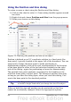
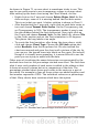
• After deselecting the Y axis grid, right-click on each data series in
turn and choose Format Data Series. On the Transparency tab,
set Transparency to 50%. The transparency makes it easy to see
the data hidden behind the first data series. Now, right-click on
the X axis and choose Format Axis. On the Label tab, choose Tile
in the Order section and set the Text orientation to 55 degrees.
This places the long labels at an angle.
• To create the third variation, after doing the steps above, right-
click and choose Chart Type. Choose the 3D Look option and
select Realistic from the drop-down list. We also twisted the
chart area around and gave the chart wall a picture of the sky. As
you can see, the legend turns into labels on the z-axis. But overall,
though it is visually more appealing, it is more difficult to see the
point you are trying to make with the data.
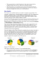
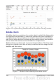
Other ways of visualizing the same data series are represented by the
stacked area chart or the percentage stacked area chart. The first does
what it says: each number of each series is added to the others so that
it shows an overall volume but not a comparison of the data. The
percentage stacked chart shows each value in the series as a part of
the whole. For example in June all three values are added together and
that number represents 100%. The individual values are a percentage
of that. Many charts have varieties which have this option.
Figure 74: Stacked and percentage stacked area charts
98 OpenOffice.org 3.x Calc Guide