
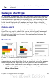
Calc Guide
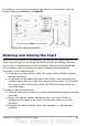

Data Labels and choose Show value as number. Then carefully
select the piece you wish to highlight, move the cursor to the
edge of the piece and click (the piece will have nine green
highlight squares to mark it), and then drag it out from the rest of
the pieces. The pieces will decrease in size, so you need to
highlight the chart wall and drag it at a corner to increase the
size.
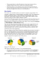
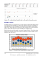
3D pie chart with realistic schema and illumination: Choose
Format > 3D view > Illumination where you can change the
direction of the light, the color of the ambient light, and the depth
of the shade. We also adjusted the 3D angle of the disc in the
Perspective dialog on the same set of tabs.
The chart updates as you make changes, so you can immediately
see the effects.
If you want to separate out one of the pieces, click on it carefully;
you should see a wire frame highlight. Drag it out with the mouse
and then, if necessary, increase the size of the chart wall.
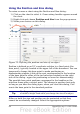
• 3D pie chart with different fill effects in each portion of the pie:
Choose Insert > Data labels and select show value as
percentage. Then carefully select each of the pieces so that it has
a wire frame highlight and right-click to get the object properties
dialog; choose the Area tab. For one we chose a bitmap, for
another a gradient and for the third we used the Transparency
tab and adjusted the transparency to 50%.
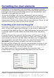
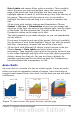
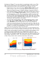
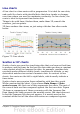
Area charts
An area chart is a version of a line or column graph. It may be useful
where you wish to emphasize volume of change. Area charts have a
greater visual impact than a line chart, but the data you use will make
a difference.
Figure 73: Area charts—the good, the bad, and the ugly
Chapter 3 Creating Charts and Graphs 97