
Calc Guide

Tip
If you cannot move an object, check to see if its position is
protected.
Gallery of chart types
Its important to remember that while your data can be presented with
a number of different charts, the message you want to convey to your
audience dictates the chart you ultimately use. The following sections
present examples of the types of charts that Calc provides, with some
of the tweaks that each sort can have and some notes as to what
purpose you might have for that chart type. For details, see the Help.
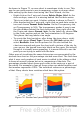
Column charts
Column charts are commonly used for data that shows trends over
time. They are best for charts that have a relatively small number of
data points. (For large time series a line chart would be better.) It is
the default chart type, as it is one of the most useful charts and the
easiest to understand.
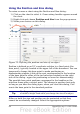
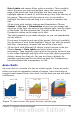
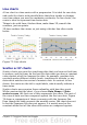
Bar charts
Figure 71: Three bar graph treatments.
Bar charts are excellent for giving an immediate visual impact for data
comparison in cases when time is not an important factor, for example,
when comparing the popularity of a few products in a marketplace.
• The first chart is achieved quite simply by using the chart wizard
with Insert > Grids, deselecting y-axis, and using Insert >
Mean Value Lines.
Chapter 3 Creating Charts and Graphs 95