
Calc Guide
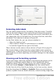
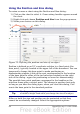
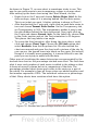
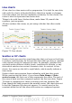

Figure 68: Formatting axis labels
Formating data labels
You can choose properties for the labels of the data series. Carefully
click on the chart element, then right-click and choose the property
you want to change. This opens a dialog with several tabs where you
can change the color of the label text, the size of the font, and other
attributes. The Label tab is shown in Figure 68.
On the Data Labels tab, you can choose whether to:
• Show the labels as text
• Show numeric values as a percentage or a number
• Include the legend box as part of the label
These choices are the same as those shown in Figure 60 on page 81.
The text for labels is taken from the column labels and it cannot be
changed here. If the text needs to be abbreviated, or if it did not label
your graph as you were expecting, you need to change it in the original
data table.
Choosing and formatting symbols
In line and scatter charts the symbols representing the points can be
changed to a different symbol shape or color through the object
properties dialog. Select the data series you wish to change, right-
click, and choose Format > Data Series from the context menu.
On the Line tab of the Data Series dialog, in the Icon section, choose
from the drop-down list Select > Symbols. Here you can choose no
symbol, a symbol from an inbuilt selection, a more exciting range from
92 OpenOffice.org 3.x Calc Guide