
Calc Guide

If you insert a trend line on a chart type that uses categories, such as
Line or Column, then the numbers 1, 2, 3, … are used as x-values to
calculate the trend line.
The trend line has the same color as the corresponding data series. To
change the line properties, select the trend line and choose Format
Trend Line. This opens the Line tab of the Trend Lines dialog.
To show the trend line equation, select the trend line in the chart,
right-click to open the context menu, and choose Insert Trend Line
Equation.
When the chart is in edit mode, OpenOffice.org gives you the equation
of the trend line and the correlation coefficient. Click on the trend line
to see the information in the status bar. To show the equation and the
correlation coefficient, select the line and choose Insert R
2
and
Trend Line Equation.
For more details on the regression equations, see the topic Trend lines
in charts in the Help.
Mean value lines
If you select mean value lines, Calc calculates the average of each
selected data series and places a colored line at the correct level in the
chart.
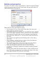
Y error bars
If you are presenting data that has a known possibility of error, such as
social surveys using a particular sampling method, or you want to show
the measuring accuracy of the tool you used, you may wish to show
error bars on the chart. Select the chart and choose Insert > Y Error
Bars.
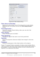
Several options are provided on the Y Error Bars dialog (Figure 62).
You can only choose one option at a time. You can also choose whether
the error indicator shows both positive and negative errors, or only
positive or only negative.
• Constant value – you can have separate positive and negative
values.
• Percentage – choose the error as a percentage of the data points.
• In the drop-down list:
– Standard error
– Variance – shows error calculated on the size of the biggest and
smallest data points
Chapter 3 Creating Charts and Graphs 83