
Calc Guide

Adding or changing titles, legend, and grids
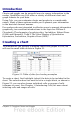
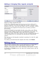
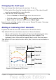
Figure 57: Titles, legend and grids
On the Chart Elements page, you can give your chart a title and, if
desired, a subtitle. Use a title that draws the viewers’ attention to the
purpose of the chart: what you want them to see. For example, a better
title for this chart might be The Performance of Motor and Other
Rental Boats.
It may be of benefit to have labels for the x axis or the y axis. This is
where you give viewers an idea as to the proportion of your data. For
example, if we put Thousands in the y axis label of our graph, it
changes the scope of the chart entirely. For ease of estimating data you
can also display the x or y axis grids by selecting the Display grids
options.
You can leave out the legend or include it and place it to the left, right,
top or bottom.
To confirm your selections and complete the chart, click Finish.
Editing charts
After you have created a chart, you may find things you would like to
change. Calc provides tools for changing the chart type, chart
elements, data ranges, fonts, colors, and many other options, through
the Insert and Format menus, the right-click (context) menu, and the
Chart toolbar.
78 OpenOffice.org 3.x Calc Guide