
Calc Guide

the icons. For the moment, we will stick to the Column chart and click
on Next again.
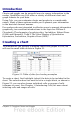
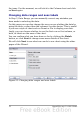
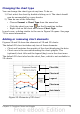
Changing data ranges and axes labels
In Step 2, Data Range, you can manually correct any mistakes you
have made in selecting the data.
On this page you can also change the way you are plotting the data by
using the rows—rather than the columns—as data series. This is useful
if you use a style of chart such as Donut or Pie to display your data.
Lastly, you can choose whether to use the first row or first column, or
both, as labels on the axes of the chart.
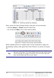
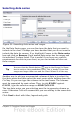
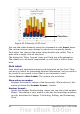
You can confirm what you have done so far by clicking the Finish
button, or click Next to change some more details of the chart.
We will click Next to see what we can do to our chart using the other
pages of the Wizard.
Figure 55: Changing data ranges and axes labels
76 OpenOffice.org 3.x Calc Guide