
Calc Guide

Introduction
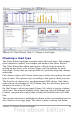
Charts and graphs can be powerful ways to convey information to the
reader. OpenOffice.org Calc offers a variety of different chart and
graph formats for your data.
Using Calc, you can customize charts and graphs to a considerable
extent. Many of these options enable you to present your information
in the best and clearest manner.
For readers who are interested in effective ways to present information
graphically, two excellent introductions to the topic are William S.
Cleveland’s The elements of graphing data, 2nd edition, Hobart Press
(1994) and Edward R. Tufte’s The Visual Display of Quantitative
Information, 2nd edition, Graphics Press (2001).
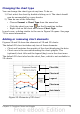
Creating a chart
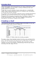
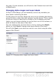
To demonstrate the process of making charts and graphs in Calc, we
will use the small table of data in Figure 51.
Figure 51: Table of data for charting examples
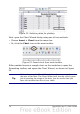
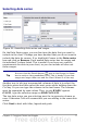
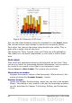
To create a chart, first highlight (select) the data to be included in the
chart. The selection does not need to be in a single block, as shown in
Figure 52; you can also choose individual cells or groups of cells
(columns or rows). See Chapter 1 (Introducing Calc) for more about
selecting cells and ranges of cells.
Chapter 3 Creating Charts and Graphs 73