
Calc Guide


A nice touch is that OpenOffice.org Chart color-codes the rising and
falling shares: white for rising and black for falling in the candlestick
chart, and red and blue in the traditional line chart.
Column and line charts
A column and line chart is a combination of two other chart types. It is
useful for combining two distinct but related data series, for example
sales over time (column) and the profit margin trends (line).
You can choose the number of columns and lines in the Chart Wizard.
So for example you might have two columns with two lines to
represent two product lines with the sales figures and profit margins of
both.
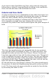
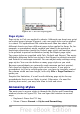
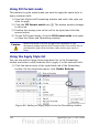
Figure 81: Column and line chart
This chart has manufacturing cost and profit data for two products,
over a period of time (six months in 2007). To create this chart, first
highlight the table and start the Chart Wizard. Choose Column and
Line chart type with two lines and the data series in rows. Then give it
a title to highlight the aspect you want to show. The lines are different
colors at this stage and don’t reflect the product relationships. When
you finish with the Chart Wizard, highlight the chart, click on the line,
right-click and chose Format Data Series.
On this tab there are a few things to change: The colors should match
the products. So both Ark Manufacturing and profit are blue and Prall
is red. The lines need to be more noticeable so make the lines thicker
by increasing the width to 0.08.
Chapter 3 Creating Charts and Graphs 103