
Calc Guide
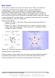

Net charts
A net chart is similar to a polar or radar chart. They are useful for
comparing data that are not time series, but show different
circumstances, such as variables in a scientific experiment or
direction. The poles of the net chart are equivalent to the y-axes of
other charts. Generally, between three and eight axes are best; any
more and this type of chart becomes confusing. Before and after values
can be plotted on the same chart, or perhaps expected and real results,
so that differences can be compared.
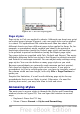
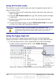
Types of net charts:
• Figure 78 - Part 1: Plain net chart without grids and with just
points, no lines.
• Figure 79 - Part 2: Net chart with lines, points and grid. Axes
colors and labels changed. Chart area color = gradient. Points
changed to fancy 3D ones.
Figure 78: Two net diagrams showing totally fabricated data from
totally fictional experiments.
Other varieties of net chart show the data series as stacked numbers
or stacked percentages. The series can also be filled with a color.
Partial transparency is often best for showing all the series.
Chapter 3 Creating Charts and Graphs 101