
Operation Manual


What are highlights?
Highlights are personalized analysis based on a week's measurements data: every week-end, 1 or 2
remarkable facts are highlighted from your station's raw data.
Highlights are displayed in the event timeline of the Netatmo App.
Example
Your Netatmo station can detect temperature degradation over several weeks, CO2 peaks, large pressure
variations...
Automated recording
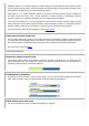
Your Netatmo station is automatically and constantly recording measurements. Those measurements are
accessible as graphs in your Netatmo app.
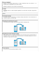
Navigating from dashboard to graphs
You can easily access the graphs anytime by turning your iPhone in landscape mode.
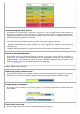
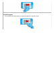
Navigating from events timeline to graphs
When you select (touch on) a notification or a highlight in your event timeline and tilt your iPhone/Android, the
corresponding section of the graph where this event took place is automatically displayed. This event is
indicated by an orange marker on the graphs.
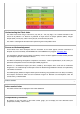
Zoom in and out
You can zoom in and out by pinching the graphs in and out.
Graphs
Graphs