Brand manual Update – Q4 2022
Values Tonality Our values are what we stand for – they make up our moral compass. Mousetrapper is a closeknit and innovative company committed to improving people’s ergonomics and wellbeing. We are secure in our knowledge and desire to use it for making everyday life simpler and less painful for as many people as possible. Tonality is the linguistic component of our brand – how we speak and write about ourselves in various channels and contexts.
Logotype Typeface There are several variants of our logotype. First and foremost, we use our logotype with the caption “The Wellness Mouse” when we just talk abour our mices. When we talk about all our products, or a specific accessory, we use the caption ”Wellness Ergonomics”. However, where the caption feels superfluous, the logotype is used without it. There are negative versions of all logotype variants. In our material, we chiefly try to use our primary typeface: Hind.
Color palette Material – How it can look Our color palette consists of four colors: grey, red, beige and blue. All of them can be used as a background, devider, textboxes etc. They can also be used with opacities when needed. When something needs to be highlighted, like ”News”, ”Try for free”, it can be used in the shape shown below. Here are some exampels of how different kind of material can look. Full page advers in magazines, flyers, social media etc.
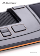
Product images Mood/complementary images We have both clipped images of all our products and images in working environment. Here are exampels of complementary images that can be used both by themselfs and together with product images. They can also be used as backgrounds.
MOUSETRAPPER.