
User`s guide
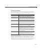
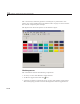
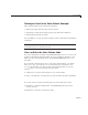

Color Palette
• A More Colors push button
• A preview of the selected c olor, below the color cells, defined as a text
component
• Text components to specify the red, blue, and green color values
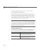
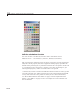
Use the Color Palette
These are the basic steps for using the color palette.
1 Clicking a color cell toggle button:
• Displays the selected color in the preview area.
• The red, green, and blue values for the newly selected color are displayed
in the R, G,andB fields to the right of the preview area.
• Causes
colorPalette to return a function handle that the host GUI can
use to get the currently selected color.
2 Clicking the E raser toggle button, causes colorP alette to return a value,
NaN, that the host GUI can use to remove color from a data point.
3 Clicking the More Colors button displays the standard dialog box for
setting a color.
15-53