
User`s guide

11 Lay Out a Programmatic GUI
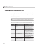
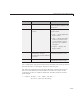
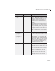
Component Function Description
“Slider” on page
11-28
uicontrol
Sliders accept numeric input within
a specified range by enabling the
user to move a sliding bar, which is
called a slider or thumb. Users move
the slider by clicking the slider and
dragging it, by click in g in the trough ,
or by clicking an arrow. The location
of the slider indicates the re lative
location within the specified range.
“Static Text” on
page 11-30
uicontrol
Static text controls display lines of
text. Static text is typically used
to label other controls, provide
directions to the user, or indicate
values associated with a slider.
Users cannot change static text
interactively.
“Table” on page
11-24
uitable
Tables contain rows of numbers,
text strings, and choices grouped
by columns. They size themselves
automatically to fit the data they
contain. Rows and columns can be
named or numbered. Callbacks are
fired wh e n table cells are selected
or edited. Entire tables or selected
columns can be ma de use r-editable.
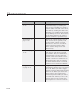
“Toggle Button”
on page 11-31
uicontrol
Toggle buttons generate an action
and indicate whether they are turned
on or off. When you click a toggle
button, it appears depressed, showing
that it is on. When you release the
mouse button, the toggle button
remains depressed u ntil you click it
a second time. When you do so, the
button returns to the raised state,
showingthatitisoff. Useabutton
11-12