
User`s guide
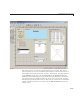

Add Components to the GUI
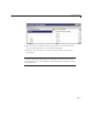
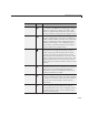
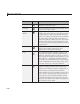
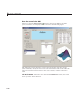
Component Icon Description
Push Button Push buttons generate an action w h en clicked.
For example, an OK button might apply settings
and close a dialog box. When you click a push
button, it appears depressed; when you release
the mouse button, the push button appears raised.
Slider Sliders acce pt numeric input within a specified
range by enabling the user to move a sliding bar,
which is called a slider or thumb. Users move the
slider by clicking the slider and dragging it, by
clicking in the trough, or by clicking an arrow.
The location of the slider indicates the relative
location within the specified range.
Radio Button Radio buttons are similar to check boxes, but
radio buttons are typically mutually exclusive
within a group of related radio buttons. That
is, when you select one button the previously
selected button is deselected. To activate a radio
button, click the mouse button on the object. The
display indicates the state of the button. Use a
button group to manage mutually exclusive radio
buttons.
Check Box Check boxes can generate an action when checked
and indicate their state as checked or not checked.
Check boxes are useful w hen providing the
user with a number of independent choices, for
example, displaying a toolbar.
Edit Text
Edit text components are fields that enable users
to enter or modify text strings. Use edit text wh en
you want text as input. Users can enter numbers
but you must convert them to their numeric
equivalents.
Static Text Static text controls display lines of text. Static
text is typically used to label other controls,
provide directions to the user, or indicate values
associated with a slider. Users cannot change
static text interactively.
6-21