
Specifications

Setting Component Properties — The Property Inspector
3-49
• off — The control is disabled and its label (set by the string property) is
grayed out.
•
inactive — The control is disabled, but its label is not grayed out.
When a control is disabled, clicking on it with the left mouse button does not
execute its callback routine. However, the left-click causes two other callback
routines to execute:
1 First the figure WindowButtonDownFcn callback executes
2 Then the control’s ButtonDownFcn callback executes
A right mouse button click on a disabled control posts a context menu, if one is
defined for that control. See the
Enable property description for more details.
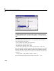
Setting Panel and Button Group Properties
Panels and button groups group related components. A panel or button group
can have a title and a border. You can also specify the background color.
Title. Panel and button group properties enable you to set the title, as well as
its font, font size, font angle, font weight, and its position relative to the panel.
Suppose you want a panel with the title “Plot Types” and you want the title:
• Displayed in Times font, 12-point, italic, bold
• Positioned at the top right of the panel
Set the following panel properties:
•
Title Plot Types
• FontName Times
• FontUnits points
• FontSize 12
• FontAngle italic
• FontWeight bold
• TitlePosition righttop
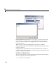
Border.
Suppose, in addition, you want the panel to have a 2-point wide, white
and blue, beveled-out border.