
Specifications

Using the Layout Editor
3-13
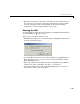
Button Group
Button groups are like panels but can be used to manage exclusive selection
behavior for radio buttons and toggle buttons.
For radio buttons and toggle buttons that are managed by a button group, you
must include the code to control them in the button group’s
SelectionChangeFcn callback function, not in the individual uicontrol
Callback functions. A button group overwrites the Callback properties of
radio buttons and toggle buttons that it manages.
ActiveX Component
ActiveX components enable you to display ActiveX controls in your GUI. See
“Adding an ActiveX Control to a GUI” on page 4-17 for an example.
Note Only figures can have child ActiveX components. Panels and button
groups cannot.
ActiveX components are available only on the Microsoft Windows platform.
Adding Components to the Layout Area
You can place a component in the layout area in one of these ways:
• Drag the component from the component palette into the layout area and
drop it.
• Select the component in the component palette. The cursor changes to a
cross.
- Place the cursor in the layout area where you want the upper-left corner
of the component to be and click.
- Place the cursor in the layout area where you want the upper-left corner
of the component to be, then set the size of the control by clicking and
dragging the cursor to the lower-left corner before releasing the mouse
button.
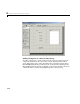
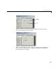
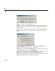
This is an example of a GUI in the Layout Editor. Note that components in the
Layout Editor are not active. “Running the GUI” on page 3-19describes how to
generate a functioning GUI.